2
$\begingroup$

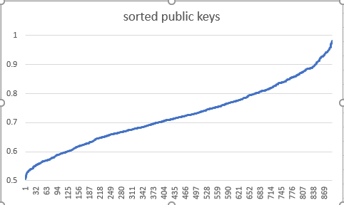
I converted ~1000 public keys generated from chrome's RSASSA-PKCS1-v1_5 implementation, converted them to decimal, prepended a "0." to them, and sorted them.

This is the graph that I got:

enter image description here

It puzzled me a little bit because it looks like an inverse normal distribution. I expected a uniform distribution (i.e. straight line). what gives?

the datapoints are the actual values of the keys, you could say normalized 0 to max, sorted, and then plotted by index in the sorted array.

$\endgroup$
2
  • $\begingroup$ A public key consists of a public exponent, a modulus and of course a specific encoding. What is it that you actually sorted? Could you update the question for that? $\endgroup$
    – Maarten Bodewes
    Commented Oct 3, 2017 at 9:59
  • 1
    $\begingroup$ Note also that RSA public keys are independent to the PKCS#1 padding method used, even if the API does make the distinction between padding methods during key pair generation. $\endgroup$
    – Maarten Bodewes
    Commented Oct 3, 2017 at 9:59

1 Answer 1

0
$\begingroup$

It's not perfectly clear what your graph is actually displaying.

However, if you expect that $k$-bit RSA keys are equidistributed between $2^{k-1}$ and $2^k$, well, that's not likely (unless the key generator goes out of its way to try to ensure that).

Remember, an RSA key is (usually) produced by independently selecting two primes from a range of $[c2^{k/2}, 2^{k/2}]$ (where common values of $c$ are $0.75$ and $\sqrt{1/2} \approx 0.7071$; it varies between implementations; I don't know what Chrome uses).

Each prime might be approximately equidistributed, but the product of two such primes will be somewhat closer to a normal distribution, with intermediate values being of higher probability; however note that it won't really be that close to normal.

$\endgroup$
5
  • $\begingroup$ makes more sense if I mention that those are the sorted keys maybe. It's not exactly normal. calculated mean: 0.72473151, std: 0.101483162, but it doesn't fit exactly; the keys are a little flatter. thank you for the insight! $\endgroup$
    – guest
    Commented Oct 2, 2017 at 15:44
  • $\begingroup$ I understand the keys were sorted, but what does the graph actually show? Something like 'percentage of keys with initial digits less than the value given on the x-axis'? That doesn't jive with the values shown, but I can't think of anything more likely... $\endgroup$
    – poncho
    Commented Oct 2, 2017 at 15:47
  • $\begingroup$ the datapoints are the actual values of the keys, you could say normalized 0 to max $\endgroup$
    – guest
    Commented Oct 2, 2017 at 15:51
  • $\begingroup$ @guest: got it; so this shows 'the number of keys (out of 1000)' (x-axis) that have a value > $y2^k$ (where values of $y$ given on the y-axis). Yes, it would appear that my explanation turns out to be the appropriate one; the right and left edges of the graph are near vertical as there are relatively few keys with $y$ values that high/low $\endgroup$
    – poncho
    Commented Oct 2, 2017 at 15:57
  • $\begingroup$ @guest: BTW; we can deduce from your graph that Chrome uses $c = \sqrt{1/2}$; if it used $c = 0.75$, we'd never see a key with a $y$ value smaller than 0.5625... $\endgroup$
    – poncho
    Commented Oct 2, 2017 at 16:02

Your Answer

By clicking “Post Your Answer”, you agree to our terms of service and acknowledge you have read our privacy policy.

Not the answer you're looking for? Browse other questions tagged or ask your own question.